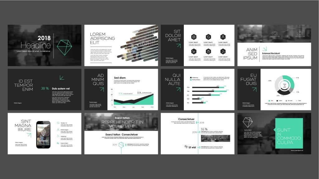
Designing an effective presentation is essential for several reasons. A well designed presentation can help you better communicate your ideas and messages to your audience. Moreover, a well designed presentation can also help to make your presentation more visually appealing and engaging, which can ultimately help to improve its overall impact. It’s not how you present, in person, a video or voice call, etc. It’s essential to have a good presentation design to make an effort.
What is a presentation design?
A presentation design is simply creating a visually appealing and effective presentation. This can involve choosing the right color and font, creating an effective layout, and incorporating multimedia elements such as photos, videos, and infographics. Ultimately, the goal of presentation design is to help you create a presentation that is both visually appealing and easy to understand.
A presentation designer looks for ways to create internal conflict within an audience. This means they feel the weightiness of a problem and actively hope for the relief of a solution. The yin and yang of problem and solution is the presentation designer’s true north, the guiding principle of every piece of information included in a deck.
Reasons why dose it is important to have a good presentation design
Makes you memorable
A good design presentation could be in a series of PowerPoint slide’s. It will create an impression and portray you well in all aspects of your business. In modern marketing, especially digital marketing, everyone wants to be remembered – for the right reasons, at least.
Design should grab the attention
A good presentation design should be able to grab attention within the first few seconds. This can be done in various ways: a PowerPoint slide, Prezi, or Canva presentation, contrasting colors, an eye-catching headline, an interesting image, and other visuals. A good presentation design should also be easy to navigate, so your audience can easily find the information they are looking for.
Must tell your story
Presentations are like stories, not lists, and stories have a structure. They build towards an impact moment and unleash a wave of momentum that changes people’s perceptions and preconceived notions. Good stories aren’t boring, and neither are great presentation’s.
To Create Emphasis
Creating emphasis in your presentation design is essential to help your audience focus on the most important elements of your presentation. This can be done in a variety of ways, such as using colors, bolding or italicizing text, or using different font sizes. You can also use white space to create emphasis by ensuring plenty of space around the most important elements of your presentation.
Process information
You want to be able to deliver your message quickly and as clearly as possible. A well-designed presentation will take large paragraphs of text and break it up into bite-sized chunks with imagery, icons, or infographics to support it. It will enable you to talk openly about your presentation without reading directly from the screen. It will also allow your audience to skim-read and take in as much of the key information as possible in an attractive way.
A helpful aid in the design
A helpful aid is using templates. Templates provide a pre-designed presentation that you can easily customize to fit your specific needs. This can save you a lot of time and effort and help ensure that your presentation looks professional and polished. Additionally, there are many different types of templates available, so you should be able to find one that fits your presentation’s specific style and tone.
What are some common mistakes made in presentation design?

Some common mistakes in presentation design include using too many colors, fonts, or images, as well as failing to create enough white space. Additionally, other common mistakes include using too much text on each slide, as well as not including enough transitions between slides. Ultimately, these mistakes can make your presentation appear cluttered, confusing, and overwhelming, which can ultimately detract from its overall impact.
What are some tips for creating an effective presentation design?
Some tips for creating an effective presentation design include keeping your audience in mind at all times, using templates, and using colors, fonts, and images sparingly. You should also make sure to create plenty of white space and use transitions sparingly between slides. Ultimately, by following these tips, you can help ensure that your presentation is visually appealing and easy to understand.
Conclusion.
In conclusion, presentation design is important to creating a great presentation. By keeping your audience in mind, using templates, and using colors, fonts, and images sparingly, you can help ensure that your presentation is both visually appealing and easy to understand. Additionally, by using transitions sparingly and creating plenty of white space, you can help further ensure that your presentation is easy to follow and does not appear cluttered. Ultimately, by following these tips, you can create a presentation that is sure to engage and inform your audience.
Information contained on this page is provided by an independent third-party content provider. Binary News Network and this Site make no warranties or representations in connection therewith. If you are affiliated with this page and would like it removed please contact [email protected]


Comments